(One source added January 28, 2010)
One of the basic problems in reaching rational conclusions with regard to global climate change problems is that AGW proponents and skeptics largely use different data sources and very different analyses of the global temperature data to support their cases.
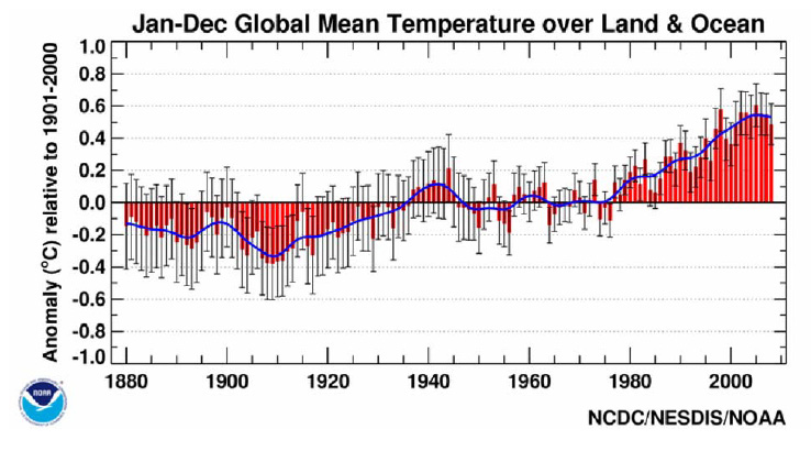
Global Temperatures According to NOAA (click to enlarge)
This first chart shows a typical global temperature chart similar to those often used by AGW supporters. Like most such charts, it represents global temperatures based on ground-based readings, and is apparently constructed by smoothing annual data. It shows the familiar “hockey stick” emphasizing the rise in temperatures since the mid-1970s that has become so familiar in AGW presentations.
The Satellite Data Shows What Appears to Be a Very Different Picture
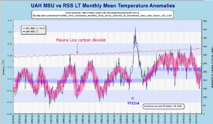
And Using Satellite Data (click to enlarge)
AGW supporters almost never use satellite data on near-ground temperatures despite its availability since 1978. This second chart shows what appears to be a very different picture using it. One would think that the two sources of data would yield quite similar trends and have important similarities since they attempt to measure air temperatures so close to each other. But this appears initially not to be the case.
What the satellite data shows is a roughly flat trend with 3-5 year cycles from 1978 through about 1996. This cycle appears to be closely related to the El Nino Southern Oscillation (ENSO) which shows a very similar pattern. But the flat trend shows no obvious effects from the increasing atmospheric CO2 levels during this crucial period for the AGW’s point of view.
Then in 1998 there was a large spike in temperatures (which appears to be largely unexplained by anyone and has no obvious relation to changes in CO2 levels) that occurred just when the 3-5 year cycle might have been expected to bottom.
In the early 21st Century the same essentially flat pattern of 3-5 year cycles appears to reestablish itself in the satellite data but at a slightly higher temperature until a breakdown occurred in late 2007 back down towards what may turn out to be the original levels in the 1978-96 period.
So it appears that the the two charts suggest very different things. The AGW presentation obscures the 3-5 ENSO cycle and emphasizes what appears to be a fairly steady increase in temperatures from the 1970s on that makes the presumed influence of rising CO2 more plausible. The satellite chart, on the other hand, highlights the ENSO cycle and the abrupt changes in 1998, and makes the presumed influence of CO2 appear implausible.
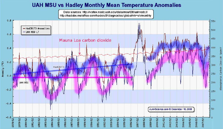
Ground (blue) and Satellite (red) Temps (click to enlarge)
If both monthly ground-based and satellite data are combined on one chart (the third one), there appear to be more similarities between the two charts. In the 1978-96 period the ground data (highlighted in blue) appears to increasingly diverge from the satellite data and increases during the 1978-96 period rather than showing the flat trend exhibited by the satellite data. But there appear to be substantial similarities between the two data sets thereafter.
So in the ground-based case there appears to be a gradual rise in temperatures during 1978-2005 which appears to be at least somewhat consistent with the increase in CO2 levels. And in the satellite case there is no visual support for a gradual increase or any apparent role for CO2 during the whole period.
Increasing Reason to Question the Ground-based Data
There is increasing reason to question the basic ground-based data as well as the rationale for the AGW interpretation of it. There have been a number of studies suggesting that ground-based data is severely compromised by urban heat island effects, inappropriate placement of monitors that increase recorded temperatures over what they would have been if the instruments had been properly cited, and the drop-out of a large number of rural stations in the 1970s. The urban heat island effects arise because urban areas retain heat much more than non-urban areas and many urban areas in the US and elsewhere expanded rapidly in the late 20th Century. This may have been accentuated by the decision to drop many rural sites. So prior to 1997 the upward bias in the ground-based temperatures may represent little more than the results of these three effects.
In addition, there are many reports that the ground data has been subjected to substantial and often repeated adjustments for various factors. In the case of the crucial HadCRUT ground-based data developed in Great Britain, and the source most often used by the United Nations, the custodian has refused to release the data and their manipulations of it and recently said that they have not even retained the original observations. So it now appears to be impossible to reconstruct exactly what the custodian may have done with the data despite the fact that this is the data most often relied upon by AGW supporters to make their case. Finally, the heavily smoothed ground-based annual data appears to hide rather than illuminate what has actually happened.
For more information on the problems with the ground-based data see here and more recently here.
So what should we make of this seemingly perplexing but very important battle of the global temperature charts? A reasonable interpretation is that the AGW charts cleverly hide the ENSO cycle through use of annual data, heavy smoothing, and questionable data and show a gradual increase in temperatures starting in the mid-1970s due to an upward bias in the data. But If monthly data are used, no smoothing is carried out, and the increasing ground-based temperature data during 1978-96 is assumed to be replaced with the flat trend line shown in the satellite data, the two data sources would actually appear to be quite consistent except that the ground-based data is generally higher than the satellite data. This difference may also be due to biased ground-based data. But if this substitution is made, the same major features would appear in both cases.
I believe it is incumbent on AGW supporters to show why the monthly satellite data without smoothing should not be used since it avoids using the suspect ground-based data and provides a more accurate picture of what actually happened. It is they, after all, that are asking the world to spend astronomical amounts on the basis of their hypothesis. If this is done, their “hockey stick” disappears and along with it the familiar AGW arguments for their hypothesis. This is not proof of biased 1978-96 ground data but appears to be the most reasonable explanation of the remaining differences between the two data sources.
The satellite data may have its own problems, of course, but there is reason to believe that it may be far more reliable than the ground-based data. There are also two independent data services which have delivered very similar data. A much more detailed analysis of what the satellite data can tell us can be downloaded from here, which is also the immediate source of the charts above.
When someone writes an post he/she maintains the thought of a user in his/her mind that how a user can understand it.
Thus that’s why this paragraph is perfect. Thanks!
Oh my goodness! Impressive article dude! Thank you, However
I am encountering difficulties with your RSS.
I don’t understand the reason why I am unable to join it.
Is there anybody having similar RSS problems? Anybody who knows the solution can you
kindly respond? Thanks!!
I hope you have a nice day! Very good article, well written and very thought out. I am looking forward to reading more of your posts in the future.
This is 1 of the top-quality article post on the blog which My spouse and i have browse through till date on this particular issue. Realistically wide-ranging yet to the point with out virtually any nonsense.
Mind-boggling post, I share the same views. I wonder why this kind of modern world truly does not think like myself and also the web publication master 🙂
Finally a smart blogger…I love how you’re thinking and writing!
[…] temperature changes prior to 1998 may have been due to natural oscillations related to El Nino (see here). This is a one-sided rather than the objective approach that is more likely to lead to good […]
[…] data. This strongly suggests that the global temperature changes prior to 1998 may have been due to natural oscillations related to El Nino. Jones’ approach is one-sided, rather than an objective approach that is more likely to lead to […]
[…] significant impact of fossil fuel use is likely). There also was some modest warming in 1998, which shows no apparent relation to changes in CO2 levels. Otherwise it is difficult to make the case for […]
FYI: The manipulation spreads (NCDC and GISS) —
“Skeptical climate researchers have discovered extensive manipulation of the data within the U.S. Government’s two primary climate centers: the National Climate Data Center (NCDC) in Asheville, North Carolina and the NASA Goddard Institute for Space Studies (GISS) at Columbia University in New York City.”
Coleman, John. “Global Warming – The Other Side: now online, all five (actually 7) parts here.” Scientific Blog. Watts Up With That?, January 14, 2010. http://wattsupwiththat.com/2010/01/14/john-colemans-hourlong-news-special-global-warming-the-other-side-now-online-all-five-parts-here/#more-15267
“GIStemp – A Human View « Musings from the Chiefio.” http://chiefio.wordpress.com/2009/11/09/gistemp-a-human-view/
“GIStemp « Musings from the Chiefio.” http://chiefio.wordpress.com/gistemp/
[…] comprehensive one at WUWT, an excellent one at Warwick Hughes, and a very well explained one at Carlin Economics. Tagged as: bad, climate, data, hadcrut3, stations, surface, temperature, uah Leave a comment […]
I fully agree with your thesis. Glad you found use for my graphs from an earlier version. That version still hypothecates about a cosmogenic origin for the super El Nino which I have abandoned in favor of Indian Ocean overflow. Sorry about that. If I were a politician that would be a flip-flop but in science we abandon a hypothesis when a better one is available. Please download my latest version – it is in two parts now on ICECAP and comes as two PDF files. (It just got too long to post it as one). I have more in it about falsified land temperatures. Arno
Alan,
Change the URL to http://www.cdc.noaa.gov/cgi-bin/data/timeseries/timeseries1.pl
Alan,
I have recently been working with CDC NOAAs reanalysis data set (http://www.cdc.noaa.gov/cgi-bin/data/timeseries/timeseries1.pl). It is a global three dimensional interpolation model based on a variety of source measurements including satallites. They developed a program that lets you download a time series for various changing variables for any region defined by latitude and longitude and pressure altitude. The data set covers from 1948 to present. This covers the period during accurate measurements of CO2 and I trust it to be more reliable than models that are base on a single source or parameter. The variables I am interested in are SST, surface air temperature, precipitable water, precipitation rate, and Outbound Longwave Radiation (OLR). These are the important parameters in testing the AGW hypothesis. Examining these data can give us an idea of how significant the rise in CO2 (compared with water vapor) has been in reducing OLR. My preliminary analysis of both polar regions (where water vapor is the least) indicates that CO2 has not lowered OLR. Water vapor as expected does lower OLR.