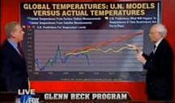
On June 30 I appeared on the Glenn Beck show, where I showed two charts from my Comments on the proposed EPA endangerment finding report. Although these two graphs do not prove or disprove the existence of significant global warming as a result of increasing levels of carbon dioxide in the atmosphere (the principal UN hypothesis), they are readily understandable and suggest that substantial such warming from this cause is implausible.
UN Temperature Projections Compared with Measured Global Temperatures
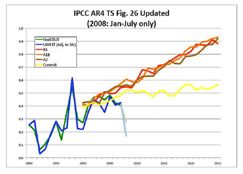
Comparison of UN Projections with Temperatures (click to enlarge)
The first graph compares some of the United Nations IPCC model projections (in red, orange, and brown) and actual global temperature surface (green) and satellite (blue) measurements. There is also a yellow line representing the UN’s projection of future temperatures if there were no further human caused carbon dioxide (CO2) emissions. The vertical scale shows temperatures and the horizontal scale calendar years.
It is quite evident that there appears to be an increasing divergence between the UN projections and the global temperature measurements. The obvious question is how this could be if the UN projections are correct. We cannot rule out a brief divergence between projections and temperatures, of course, based on other random and unexplained factors.
But the other seemingly more likely possibility is that the UN projections are substantially inaccurate and exaggerate the projected temperature increase on the high side. Subsequent temperature measurements (not shown here) do not resolve this discrepancy. If the projections are substantially too high, perhaps they do not deserve to be taken as seriously as many people now do.
Decreasing Measured Temperatures and Increasing CO2 Levels
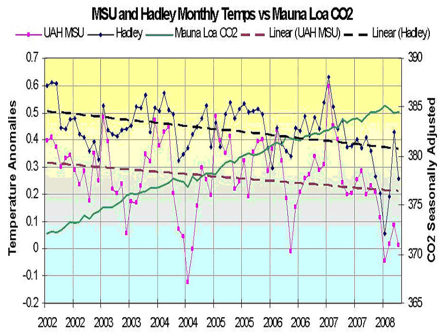
Comparison of Decreasing Temeratures to Increasing CO2 (click to enlarge)
The second graph also shows global temperatures by calendar year for the period 2002 until mid-2008, but superimposes on this chart yearly atmospheric CO2 levels (shown in green) by year. Since there are two principal sources of global temperature data, surface (shown in black) and satellite (shown in red) measurements, both are shown along with trend lines for each. Inspection of the data shows that while temperature data were trending down over this period, CO2 levels were steadily increasing.
This again suggests that either there was a brief, random, divergence from what would be expected if the UN hypothesis concerning the effects of increasing CO2 levels on temperatures are correct, or that the UN models and hypothesis are simply incorrect. The brief divergence possibility appears implausible because very similar divergences have appeared previously during the periods 1880 to 1910 and 1940 to the mid-1970s. In fact, the changes in global temperatures appear to be cyclical and to be very similar to the pattern of the Pacific Decadal Oscillation (PDO) which has roughly a 60 year cycle (with 30 up years followed by 30 down years). This leaves the other possibility–that something may be wrong with the UN’s basic hypothesis that CO2 levels are the major determinant of global temperatures since the UN models do not show any such cycles and do not explain the down years from 1940 to the mid-1970s or since 1998.
And if their hypothesis is incorrect, their proposed solution, decreasing CO2 emissions into the atmosphere, would not be effective in preventing increases in global temperatures. At the very least there would appear to be other important factors influencing global temperatures besides CO2 levels that the UN has not considered. It is important that we understand what these other factors might be before committing ourselves to trying to reduce CO2 emissions at the cost of many trillions of dollars. To proceed now with reducing CO2 emissions would not only be very expensive but possibly largely futile as well.
Carlin Economics and Science » Global Temperature Charts Suggest Implausibility of UN CO2 Hypothesis – just great!
I’ve got to say it’s rather pleasing to see a relatively ‘different’ blog such as this one, good effort. I look forward to coming back frequently to see if you have uploaded another comment.
From the beginning of time, the world has been changing. Scientists have long studied the cooling and heating patterns that the earth. Whether you are for or against global warming, the facts can’t be denied that yes, the earth warms, and it just so occurs we have been going via a steady warming period. However, what goes up must come down, and also the earth will go through a cooling period as nicely. The trends have shown us this, and many say that we have already entered the cooling period. Thoughts?
I cant imagine some of the places I have been taken to by stumblupon (just currently this specific web page) I was trying to pass a few slow 60 minutes away, when stumbleupon brought me right here. What a remarkable website you have I’m so pleased to have found it I have just spent the last twenty mins going through a few of your articles and reviews, and have additionally bookmarked some of them. I will certainly be back again to read a tiny bit more when i have atiny bit more time.
Again a fair post. Offer your achates
The World Meteorological Organization (WMO) on Thu Aug 21, 2008 reported: “The first half of 2008 was the coolest for at least five years, the World Meteorological Organisation (WMO) said on Wednesday. The whole year will almost certainly be cooler than recent years, although temperatures remain above the historical average.”
Yet on 5 December 2009 they reported at the Copenhagen Summit: “This decade is the warmest on record and 2009 is likely to rank as the fifth warmest year since the beginning of instrumental climate recordings in 1850.”
This sudden backflip for the IPCC and Copenhagen Summit is making many wonder if the WMO are the latest to have adopted Michael Mann’s “trick” of massaging data to suit a preconceived agenda!
This could be a s big as Climategate!
Cheers,
Denis Maclaine
Brisbane, Australia
Dear Mr. Carlin,
I am very much interested by your skeptical views.
Not being a climatologist, nor an expert in environment issues, but only an economist sympathetic to freemarkets who’s trying to find the truth, I have two simple questions:
If we are enjoying a cooling phase since 1998, how can we explain the dramatic melting of the north pole ice these last years ?
What about the recent rise in temperatures we hear in the media ?
Thank you very much,
Emmanuel
Note by Alan Carlin: Humans do not understand many things about both the atmosphere and the oceans. Among the things we do not fully understand is why the sea ice in the Arctic Ocean reached a recent low in 2007. The important thing in the current context is whether human-emitted CO2 had much influence on this event. Since changes in CO2 levels do not appear to have a significant effect on global temperatures (see my post here), it is not reasonable in my view to attribute Arctic Ocean ice changes to changes in CO2 emissions. Changes in CO2 emissions (as currently proposed) therefore would not have a significant effect either.
On the alleged temperature rise, it certainly is not showing up in the satellite temperature data, and for reasons discussed here I do not trust the ground-based data.